In 2021, CPI launched the Earned Legitimacy Learning Cohort, a 10-week program during which participating governments worked to dismantle inequitable power dynamics and enable community-driven change. During the cohort, Glendale, CA worked to help increase the access residents had to food banks through a breakthrough innovation.
A cross-departmental team of civic innovators in Glendale, CA is helping eliminate hunger in the city through a simple yet effective innovation: a map.
Developing an insight
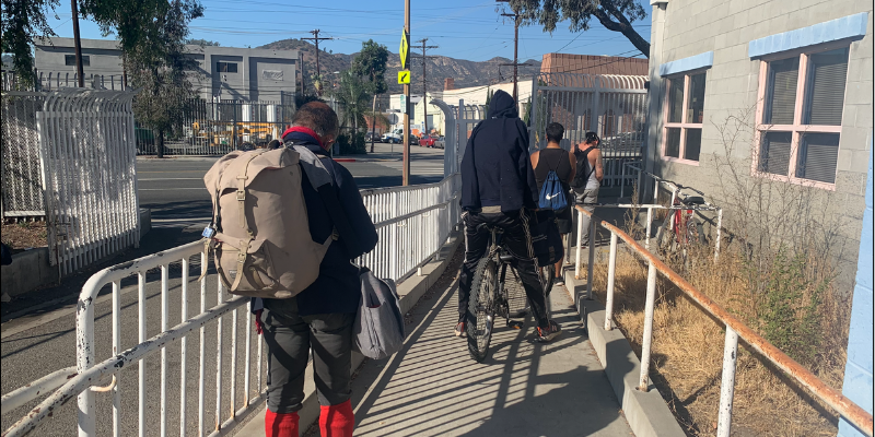
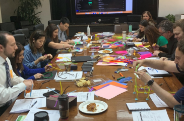
In 2020, I was part of a team of city employees who were able to work with CPI and Bloomberg Philanthropies to undergo Innovation Training. Our cross-departmental team used the Path to Innovation model to better understand and challenge assumptions about food insecurity in Glendale. We generated ideas, tested them with stakeholders, and ultimately delivered prototypes based on the feedback we received. In total, the team conducted 67 stakeholder interviews and 21 in-person observations at local food banks and food distributors to get a better feel for issues surrounding local food insecurity.
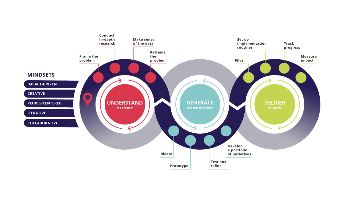 Path to innovation
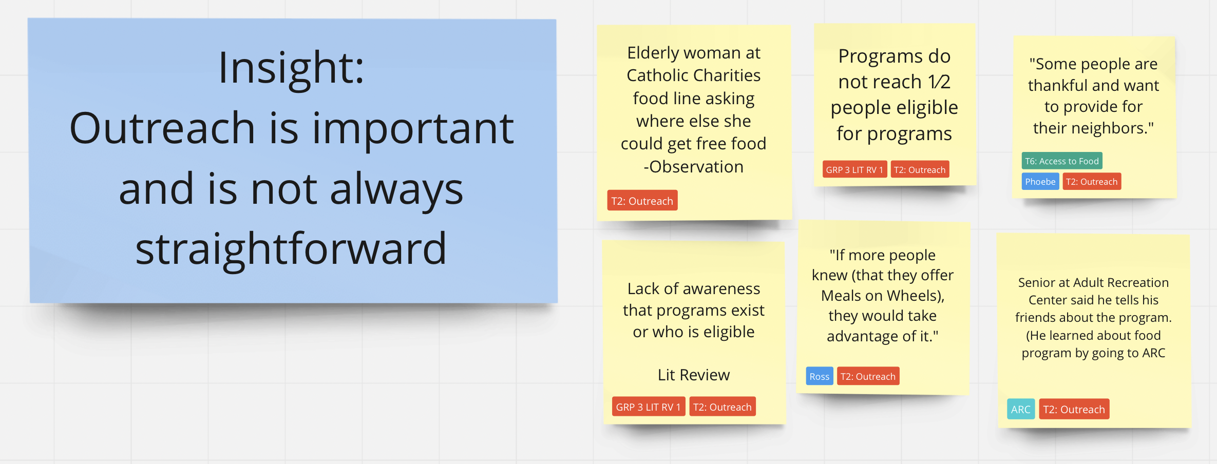
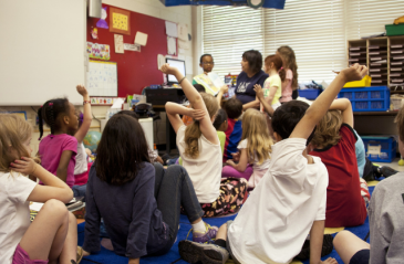
While interviewing residents in line at food banks, we were often asked where else residents could go to get more food. This led to a insight that became the primary focus of our project: residents often go to the food bank closest to them and aren’t always aware that other local resources exist.
Since each food bank typically offers 1 bag of food per family per month, knowledge of even one extra food bank in the City would double the amount of food donations that a resident could receive. A small team consisting of myself (an Innovation Project Manager for the City Manager’s Department), a GIS Manager, an Assistant City Attorney, and an Integrated Waste Supervisor convened to focus on addressing this new insight in order to reduce hunger experienced in Glendale.
Generating an idea
Initial brainstorming sessions resulted in an obvious deliverable for the project: the most convenient tool to convey information about locations is a map. We wanted this map to be accessible, timely, and easy to use.
Our group wanted the map to answer three user-derived problems we encountered during our stakeholder interviews:
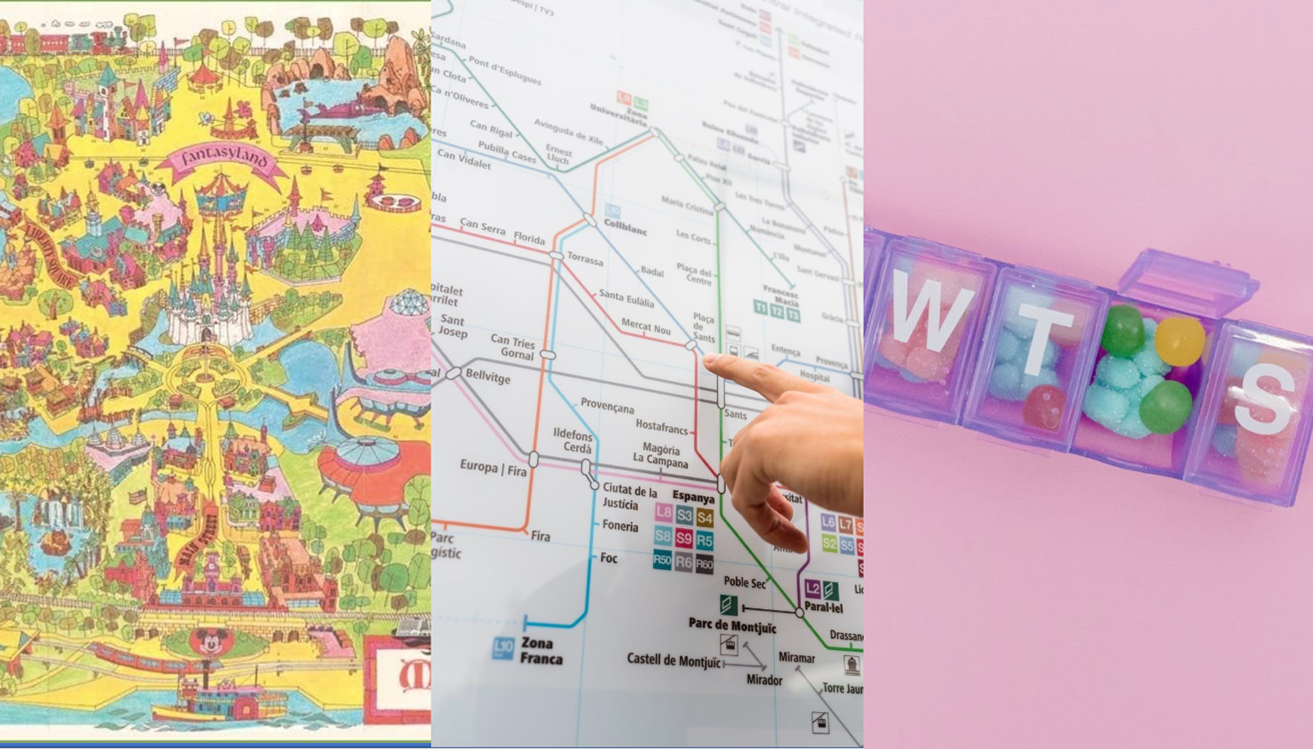
How might they replicate the warmth and joy of interacting with an illustrated map at a Disneyland theme park?
Experiencing food insecurity is devastating. Trying to get through your day without knowing when you’ll be able to eat again is agonizing. We wanted the design of our map to cut through the anxieties of hunger and provide some kind of visual comfort. The sterile, “official city document” style wasn’t going to cut it for this project. Something more personal, welcoming, and joyful was needed. The team asked stakeholders for positive experiences they associated with maps. One reference that came up frequently was illustrated maps from theme parks. This became the primary design direction for the project. Having a background in illustration, I volunteered to create a bespoke map of the city for the project.
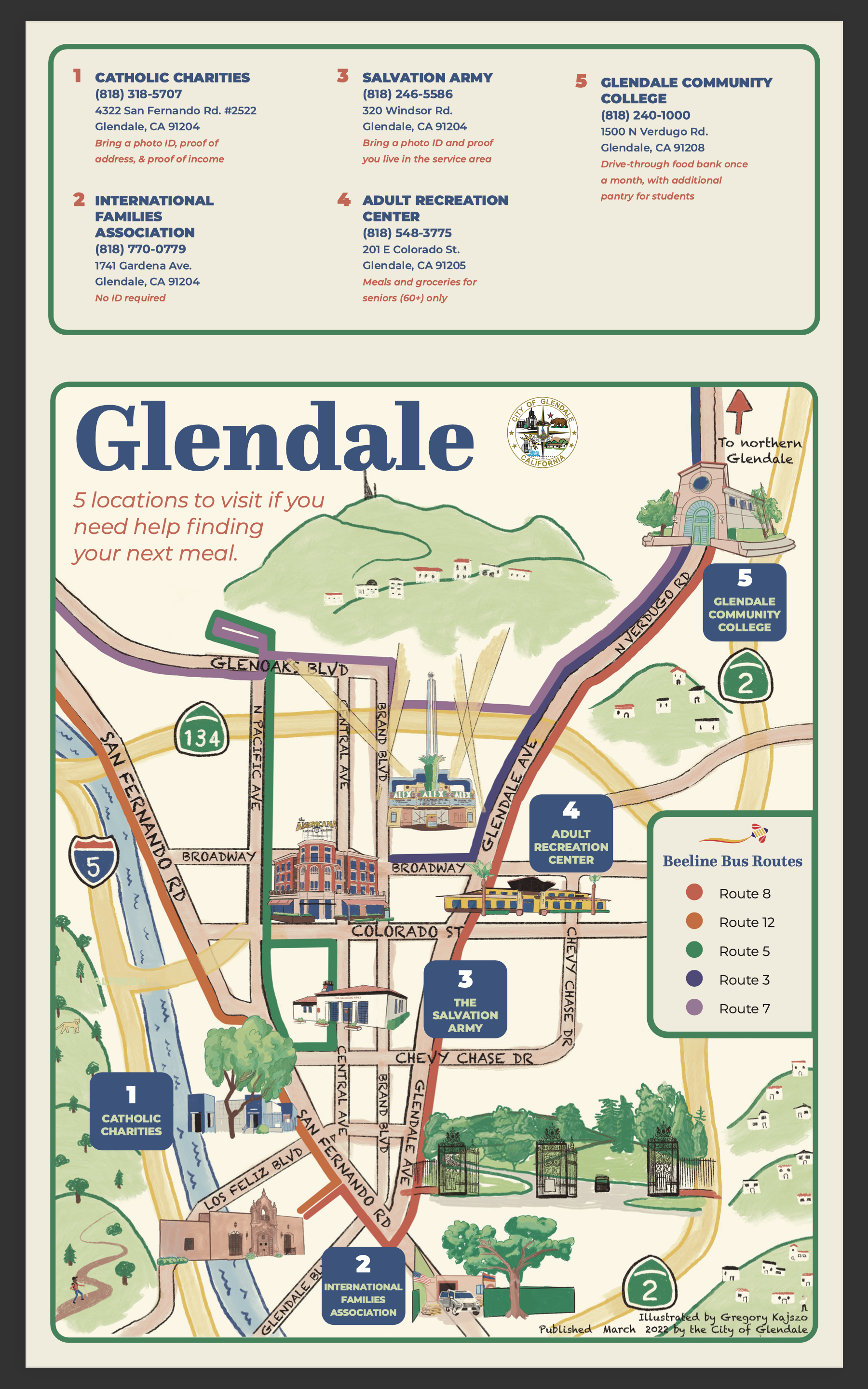
Early prototypes of the map were set at a 45-degree visual angle, similar to what you’d see on a theme park map, with the entrance oriented at the bottom. Some user testing revealed an obvious flaw with using this design in Glendale: what is an “entrance” to a city in the real world? We could orient the map from north-to-south at a 45-degree angle, but would this still be navigable to someone walking east-to-west at the eastern city border? Suddenly the top-down layout of navigation apps, whose banality we were trying to avoid, sounded much more sensible.
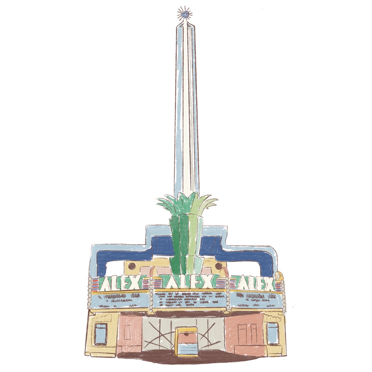
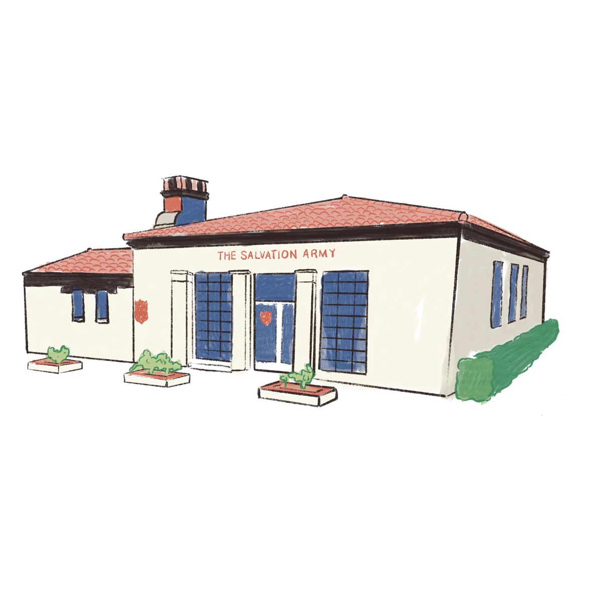
However, we determined that we could make a visually welcoming map that still provided useful information by keeping a top-down perspective and adding references of the built environment. These references included important landmarks such as the Glendale Transportation Center, the Glendale Americana, the Alex Theatre, freeways, and natural references like mountains and rivers. They were illustrated at 45-degree angles to give the impression that the map was more three dimensional than it actually is.
How might we simplify complex transit logistics in a user-friendly way?
Our interviews and in-person observations made it very clear that food bank clients in Glendale were frequent users of public transportation. Including bus line information in our map was, therefore, a no-brainer. The difficulty lay in the challenge of distilling the complexity of regional transit into a small visual resource. There were so many intersecting mobility services to consider -too many, we worried, to map coherently in the limited space we had available.
Our team aggregated mobility maps in Glendale and tried putting them all together into our prototype. This confirmed our suspicion that we couldn’t include all transportation options. We started second-guessing our decision to go with a printed medium. Was it really the best way to display a map if it had such obvious constraints?
The answer to that question lay ultimately with our prospective users. We returned to our stakeholders again to ask them about navigating public transit. This round of interviews turned our assumptions upside down.
We initially assumed that people experiencing poverty, who were a large demographic of people facing food insecurity, would not be able to afford smart phones and data plans. Our objective, taking this assumption into account, was to cram as much information as we could into a paper media for an audience that presumably couldn’t access a search engine or navigation app. Our stakeholders revealed that low-income residents almost always had access to cell data – whether it be through pre-paid plans, or public assistance programs like California LifeLine. This new insight opened opportunities for our team to explore hybrid digital solutions that could offer more complex assistance than what would be possible in a print-only map. It was still clear that a physical map would provide tremendous benefit to our potential users, but new options were now open to us.
Our team built a custom My Map in Google Maps that contained the same information in our physical map. The digital version could be accessed with a QR code placed on the physical map and would allow users to switch to more nuanced regional navigation when necessary.
With this complexity addressed, our team decided to illustrate Glendale bus lines from the City’s local Beeline service. This made visualizing bus lines much more manageable.
How might we make finding food pickup schedules as easy as navigating a Monday-Sunday pill box?
If navigating various food bank hours was complex before, it turned out to be labyrinthian during the heat of the pandemic.
Food bank hours are complex. They aren’t typically open like a regular business, Monday through Friday, 8 AM to 8 PM. There’s usually a small window of time during the week in which residents can come pick up food. That window might be on a Monday at 10AM at one location, and Thursday at 2PM at another. Our team wanted to tackle the challenge of simplifying this information.
Early brainstorming sessions conjured ideas of a weekly pill box, with individual compartments for every day, Monday through Sunday. Users don’t have to think about what pills to take on what day – they just open the Monday compartment on Monday and take the medication that’s inside. Could we reduce the food bank hours to something just as simple?
We prototyped several designs that consolidated operating hours into simple tables. The early designs looked just like pill boxes, with the day of the week as headers for each column. After creating the first prototype, we went back to confirm our data and noticed that some of it had changed amongst the chaos of the COVID-19 pandemic.
If navigating various food bank hours was complex before, it turned out to be labyrinthian during the heat of the pandemic. Protocols were constantly changing. One week a food bank could safely staff their operations, the next they would find themselves shutting down due to the most recent variant outbreak. It became clear that printing operating hours on a physical resource was out of the question. The hours would change again too quickly. Our pill box table idea was ultimately scrapped and replaced with information that was more permanent: business addresses, phone numbers, and eligibility requirements to receive food at each location.
Testing, Testing, Testing
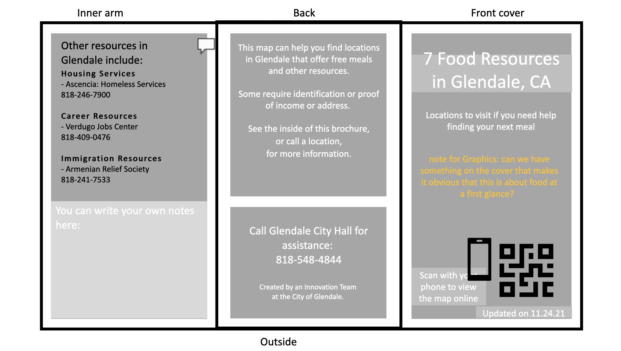
With a developed prototype in hand that addressed our initial user-centered design challenges, we returned to our stakeholders to get what we thought would be a final stamp of approval. This resulted in more feedback to consider. Interviewees wanted information other than food services. What about housing options and immigration services? We incorporated these ideas into the space freed up by our failed pill box concept.
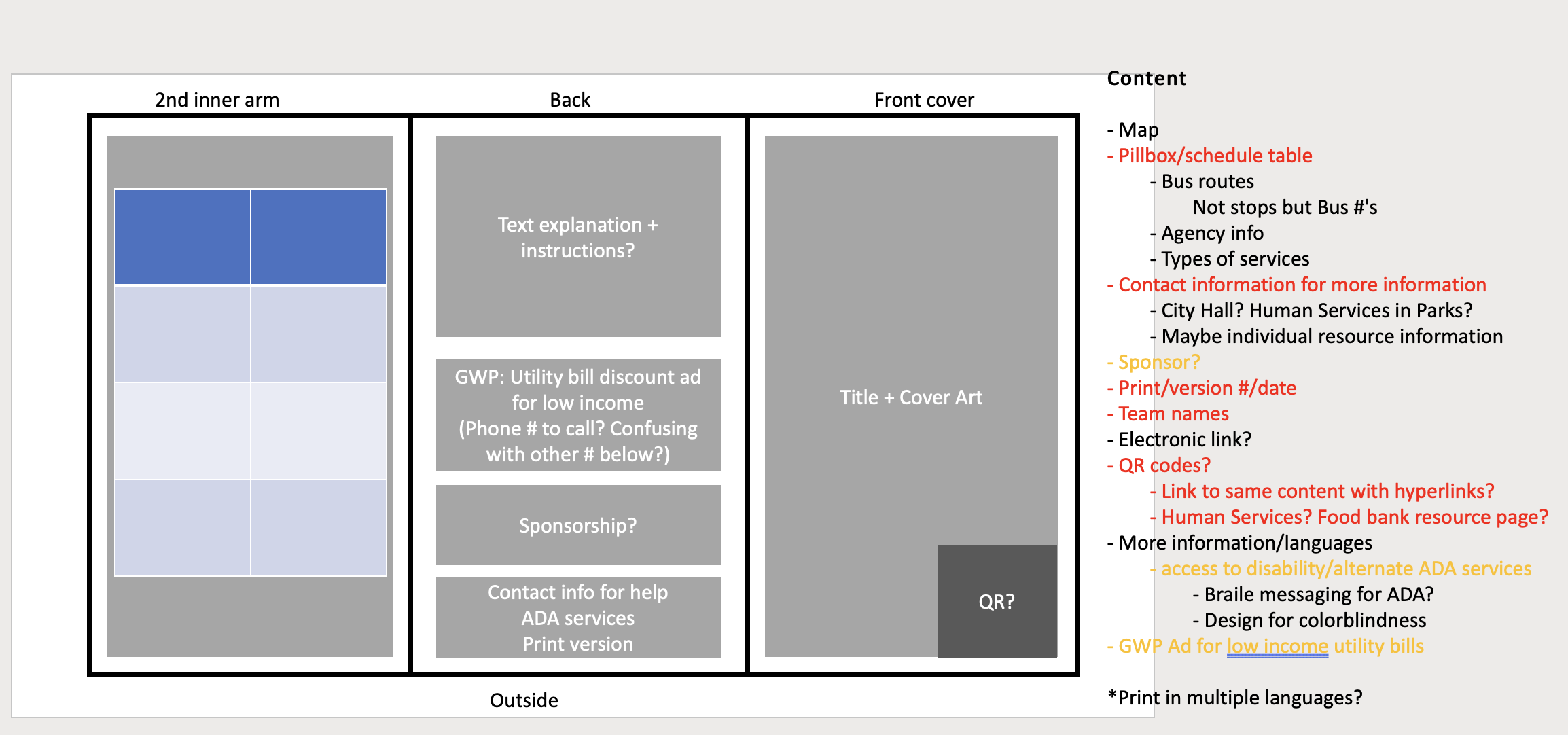
Another insight came from a project team member. Every time we reached out to a food bank we found ourselves taking copious notes: capturing the latest operating hours, what kinds of food were being offered that week, what special requirements existed for children at one location and not the other, the name of a case worker to call next time we were visiting. It was reasonable to assume that our users would find themselves in the same situation, regardless of how much of this information we tried to capture in the final product. We decided to reserve some space on the product where users could take their own notes.
Typical city trifold handouts and maps are printed on glossy paper. It can’t hold ink or graphite at all. Our team consulted with Glendale’s Graphics Department to explore alternative paper that was durable enough to survive in someone’s pocket on a rainy day, but matte enough to accept notes.
Delivering a solution
Having sufficiently tested, re-tested, and tested again all of our ideas and feedback, we finally moved forward with printing our first round of maps. The final product is a trifold handout that contains three of the most used languages in Glendale: English, Armenian, and Spanish. Copies were handed out at key locations in the community: at food banks themselves, community centers, libraries, schools, and with patrolling police officers to hand out to people they come across who are in need. We are also in the process of transforming the resource into a larger print that can be inserted into local bus stop advertisement spaces.
Measuring impact
Glendale’s Office of Innovation recently started employing an Objectives and Key Response (OKR) framework to track the success of our projects. This framework establishes objectives that we want to accomplish with a given project, followed by a few key responses that indicate if that objective has been reached.
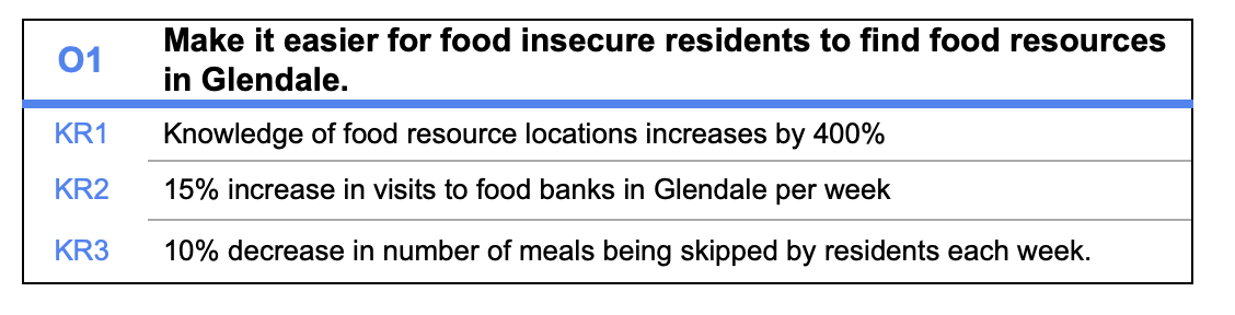
Our food map’s objective is to make it easier for food insecure residents to find food resources in Glendale. We hope to accomplish this by:
Increasing the knowledge of food resource locations by 400%
Increasing all visits to food banks in Glendale per week by 15%
Decreasing the number of meals being skipped by residents each week by 10%
Baseline surveys were sent out to food banks before the map launched to better understand where the community stands prior to the introduction of the maps. Another set of surveys will follow in approximately 6 months after the map’s launch date to help determine the impact it had.
Lessons learned
It’s tempting to take an idea for a project and run with it, especially when you have a team of four specialists who might all agree on what should be done. Civic innovation best practices push against this and ask public servants to involve users early and often during a project’s life cycle.
There were many times during the creation of our map where our team all agreed that the resource was “ready”. It can be hard to drop aspects of a project after you’ve poured time and care into it. Ultimately, you shouldn’t cling to aspects of your projects that don’t work for your users. They only way to find that out is to ask. We would have had a totally different product if we hadn’t continuously checked in with our community. We encourage other city staffers to always go out and listen to your stakeholders, no matter how good you think your product is going to be for them.